how do i spot volatility on charts without using indicators?
I look out for "scattered charts"; when i see a lot of wicks making the charts look like a thorn field i know theres some volatility in the market.
When volatility is high, forex brokers ususally increase their spread as seen on the charts. On your chart, the space between the bid and ask price lines is the spread so you will notice the space becomes unusually wider.
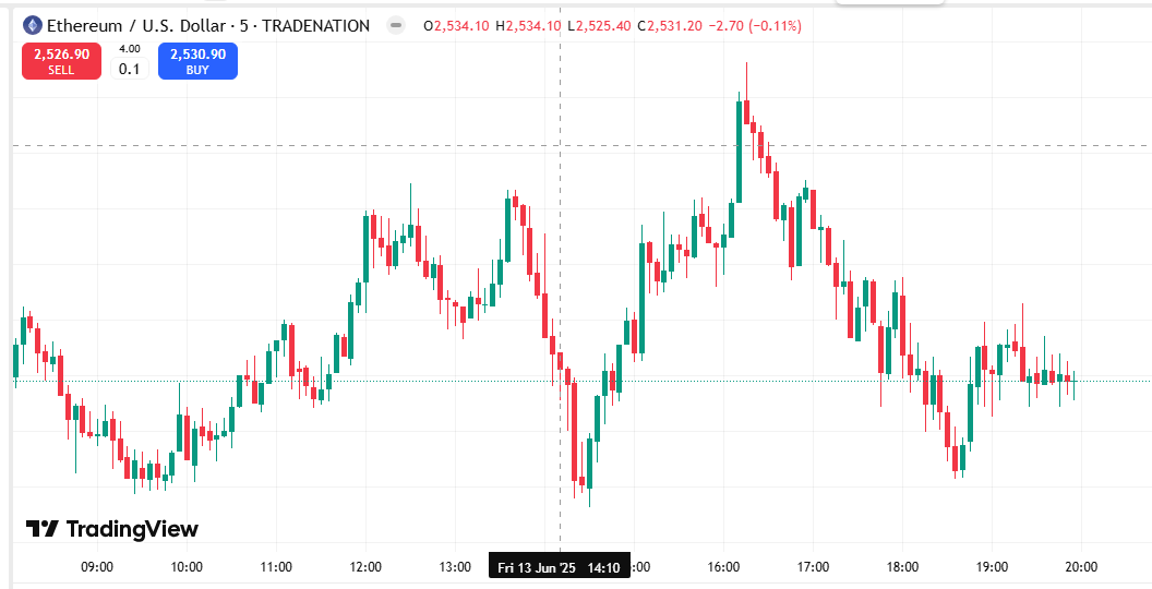
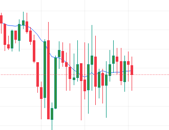
Just like @melody said, a volatile market will have a lot of wicks on candlesticks. This is an Ethereum/USD chart and cryptocurrency pairs are always very volatile so you can see that almost every candle is accompanied by a wick.
These long wicks mean you face a higher chance of your stop loss getting hit so you need to place a wide stop when trading volatile pairs
Nice one 👌
Normal Volatility
You can also use the SMA indicator as a guide. When volatility is normal, price tends to stay above or below the Simple Moving Average (SMA) line.
High/Excessive Volatility
When volatility is excessive, price tends to engulf the Simple Moving Average line
Sometimes you just need to look at the spread on the instrument you are trading, if you notice your broker has increased/widened the spread, it means they know something you dont; theres probably incoming volatiility.
When volatility is high, your broker could reduce leverage. On the charts you also see unusually tall candlesticks
You could also activate "grid lines" on your chart and check pip value the spacing between each box. From the image I attached the pip spacing is 2 pips which is small and indicates low volatility. On some highly volatile days the spacing between the grids could be as high as 10 pips. To calculate the spacing between the grids just subtract the prices between two boxes
In this chart image the grid line spacing is 10 pips each which indicates higher volatility.
So, basically as volatility increases the difference between the prices for each grid box becomes bigger.
Yes @brenda. Today volatility is low so even though the candles look big when you check the difference between the price it will give you 2 pips per box. Example 1.15460 - 1.15440 = 2 pip
I never knew this, I always thought grid lines were a waste of time so I always hid them. Thanks for sharing